
Over 2.5 years, I led a full redesign of the University of Utah’s Financial Services web ecosystem, transforming a network of 14 departments and more than 900 pages. The existing platform functioned like a database-turned-website: dense, inconsistent, and difficult to navigate, creating friction for students, staff, executives, accountants, and content owners.
As the sole designer, I delivered a complete UX transformation: a unified information architecture, modernized UI aligned with university brand standards, streamlined content strategy, centralized training hub, and standardized component templates.
The results included a 65% reduction in total pages, 35% fewer support tickets, and 70% increased training engagement.
This project highlights my strengths in systems-level UX design, cross-department collaboration, content governance, and long-horizon product ownership, all essential capabilities for impact-driven UX roles.
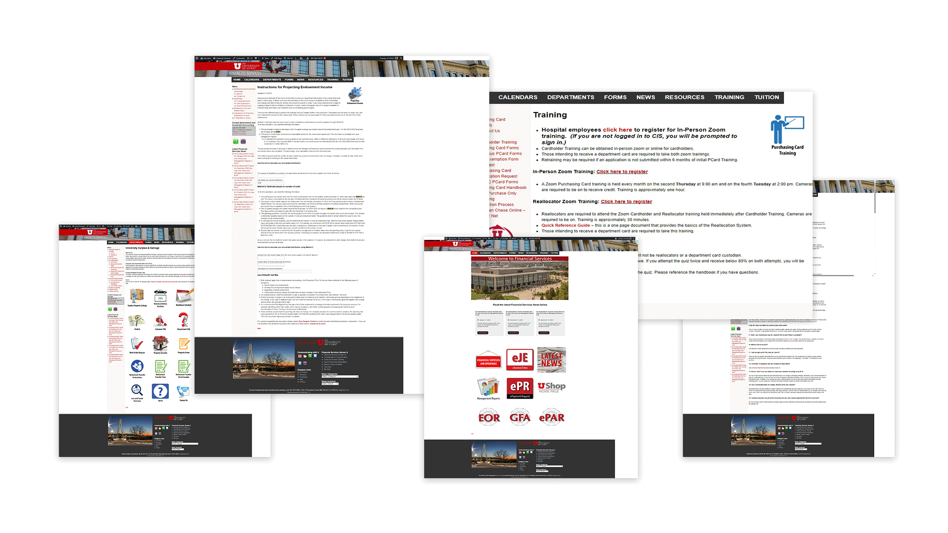
Before the redesign, Financial Services had grown organically for years. Each department built and maintained its own pages, resulting in a maze-like tunnel system: winding paths, unexplained offshoots, and navigation that often looped users back to where they started.
Over time, this organic growth created a number of usability and experience issues:
Understanding the system before designing it
![[background image] background image of office space with computers (for an erp company).](https://cdn.prod.website-files.com/694333edfae881550d65b3ae/6945c41f92e8d20090e27444_65bc2679-faf1-474c-b2bc-ae683caad4cb.avif)
KEY FINDINGS
- Large volumes of redundant and outdated content
- Dozens of pages with overlapping or unclear purpose
- Inconsistent navigation patterns between departments
- Training materials scattered across PDFs, external tools, and hidden subpages
- Many pages with little to no user engagement
The audit revealed that complexity wasn't coming from the users, it was embedded in the structure itself.
![<subject>[interface] screenshot of the software interface (for a productivity tools business)</subject>](https://cdn.prod.website-files.com/694333edfae881550d65b3ae/6945cf72a1a1d94dc146720e_Park%20building.jpg)
I met with department managers and administrators to understand pain points from two critical perspectives
USER PAIN POINTS
- Difficulty locating forms, processes, and next steps
- Confusion around department ownership and responsibility
- Overwhelmed by technical language and dense content
CONTENT OWNER PAIN POINTS
- High volume of repetitive emails and questions
- Lack of clarity around which content was still relevant
- Difficulty maintaining pages due to inconsistent structure and templates
![[interface] screenshot of collaboration interface (for a productivity tools business)](https://cdn.prod.website-files.com/694333edfae881550d65b3ae/6945cf909488dbcea4ff3305_Moot%20Training-26.jpg)
Users needed clear paths and understandable language.
Content owners needed structure, governance, and scalable templates.
This insight directly informed the creation of:
- A unified information architecture
- Standardized templates across departments
- A centralized training hub
- Clear content ownershop and publishing workflows
This IA system became the foundation for the entire Financial Services ecosystem moving forward.
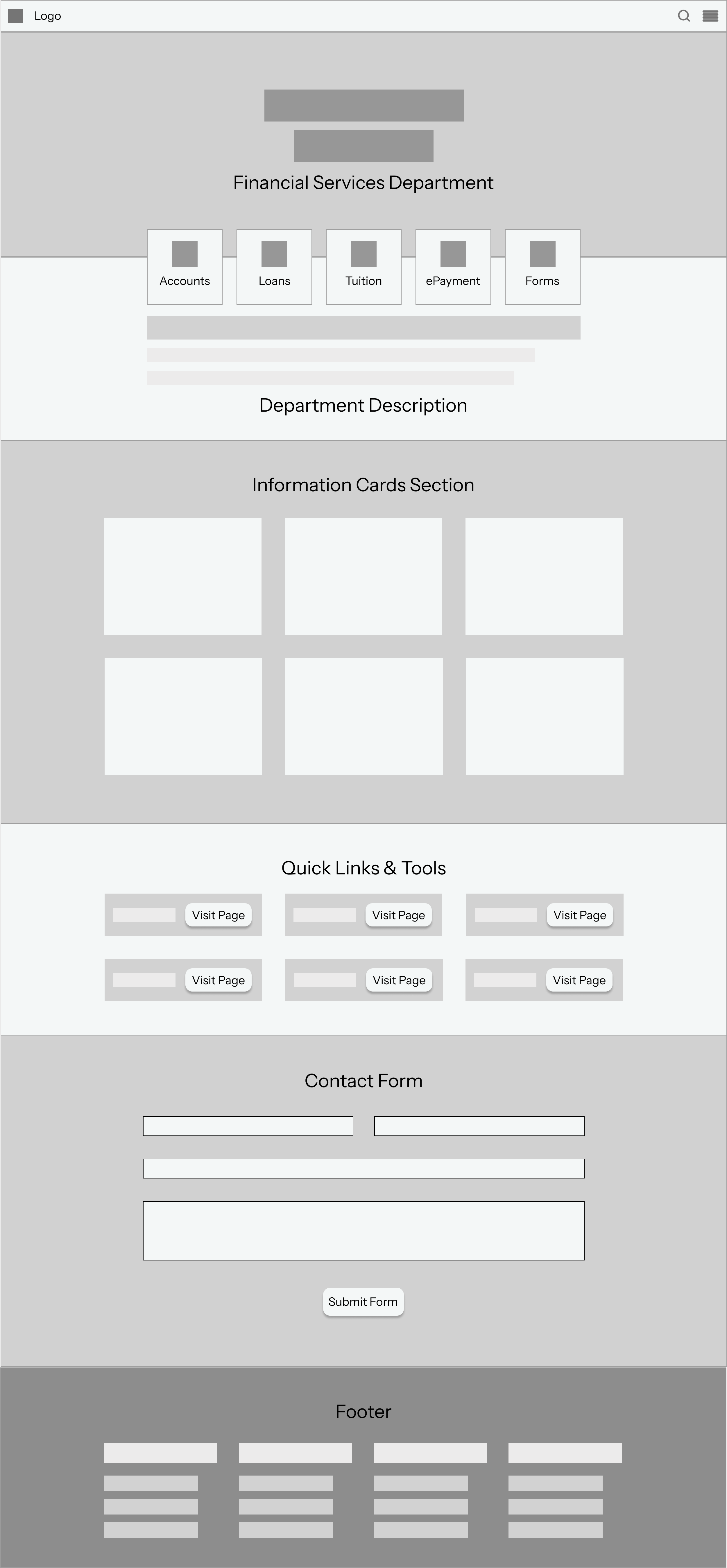
Simplified top-level categories:
Home, Departments, Forms, News, Resources, Training so users always know where to start.
Each department adopted a predictable layout:
Overview → Key actions → How-to resources → Policies & forms → Contact.
Removed and merged low-value pages; reduced the site from 909 → 304 pages.
Partnered with a copywriter to rewrite technical content in plain language and add clear page-purpose statements, improving scannability and accessibility.
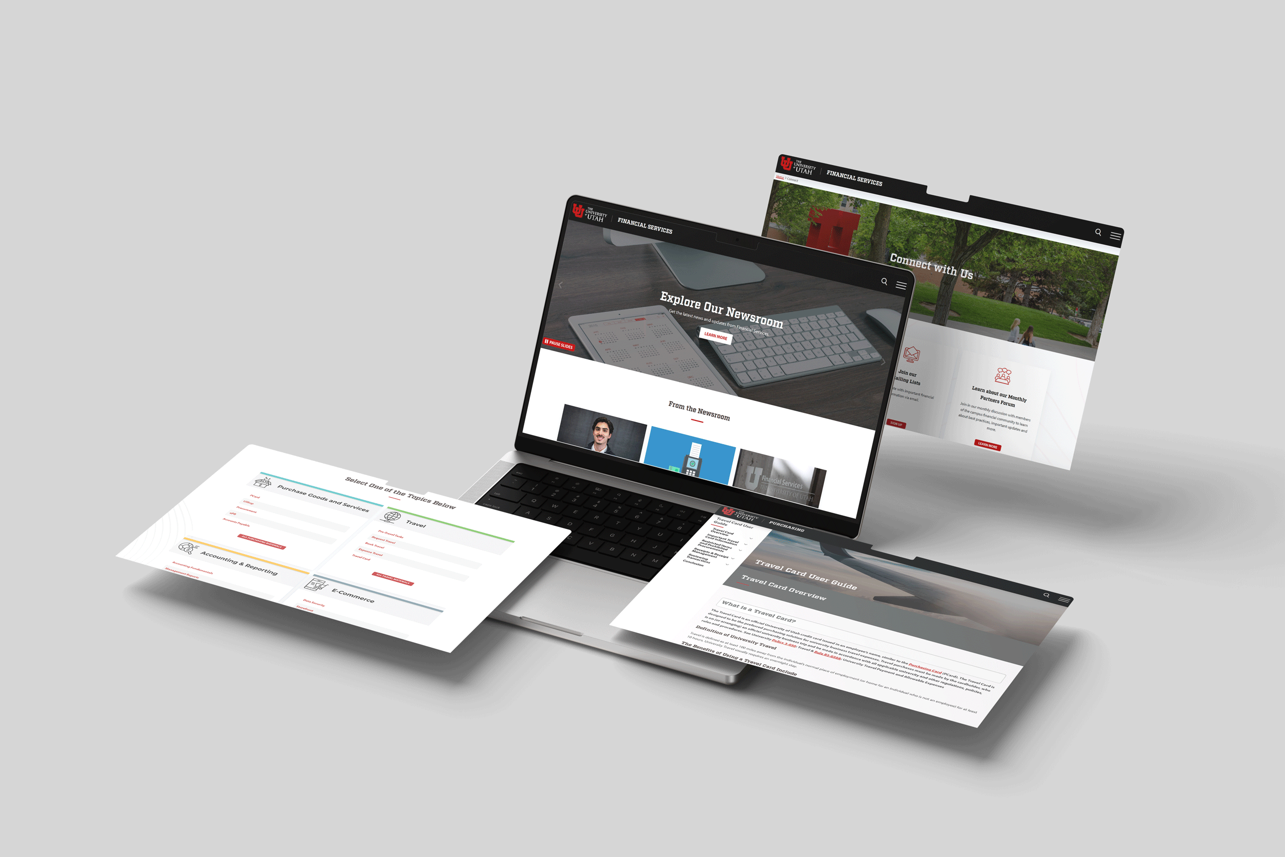
Introduced chunked content, strong visual hierarchy, and prominent action buttons so users can complete common tasks in fewer clicks.
Larger, more readable typography with improved spacing for accessibility and scannability.
Clear visual hierarchy that surfaces the most important tasks first.
Modernized action buttons that clearly signal next steps.
Consistent visual assets and iconography across all departments.
Restructured layouts that prioritize user intent over internal organization.
Fully responsive templates designed to work seamlessly across devices.
.png)
A single, intuitive destination allows users to easily find the training they are looking for.

Training content had previously been spread across PDFs, external tools, and hidden subpages, making it difficult for users to find and engage with.
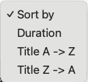
Users can quickly narrow training content by topic, role, or requirement to find what’s relevant.
![[digital project]](https://cdn.prod.website-files.com/694333edfae881550d65b3ae/694892d0e64fbec9529f5987_Screenshot%202025-12-21%20at%205.36.19%E2%80%AFPM.png)
Key details to help users quickly understand who the course is for and what to expect.
As the lead designer, I operated
in two complementary roles
throughout this project:
I aligned 14 departments with different priorities, workflows, and constraints by building shared understanding, setting clear standards, and guiding teams toward a unified structure.
Rather than designing in isolation, I worked closely with stakeholders to ensure solutions addressed both user needs and operational realities.
- Accountants and subject-matter experts
- Department managers and administrators
- Content owners responsible for ongoing maintenance
- Executives and leadership stakeholders
- Contractors and external partners
- Communications teams
I shaped the information architecture and design standards for a highly complex, multi-department ecosystem—ensuring clarity, consistency, and scalability across all Financial Services sites.
- Reduced support burden across departments
- Clear content ownership and governance
- Improved confidence in site maintenance
Reduction in support tickets
Reduction in web pages
Average page views
Increase in training engagement

This project reinforced my ability to operate at scale and lead through complexity. Over multiple years and departments, I strengthened my ability to:
- Drive ecosystem-wide UX transformation, not isolated redesigns
- Operate autonomously across large, multi-stakeholder environments
- Translate complex, regulated subject matter into clear, usable systems
- Build alignment across diverse teams with competing priorities
- Balance user needs with business, compliance, and operational constraints
- Apply scalable information architecture and content governance frameworks
- Think in terms of systems and patterns, not individual pages
These capabilities are foundational to how I approach Principal-level UX work, particularly in roles that require long-horizon ownership and cross-functional influence.
![[interface] image of travel tech software interface](https://cdn.prod.website-files.com/694333edfae881550d65b3ae/6948fed2c2b44a8b69db3e9f_LAW%20U-4.jpg)
With additional time and investment, I would focus on strengthening feedback loops and long-term scalability:
- Introduce deeper analytics dashboards to continuously evaluate navigation and task success
- Expand the component and template library to support future departments and services
- Establish ongoing user testing programs to validate changes and uncover emerging needs
- Improve site-wide search to surface high-value content more effectively
These next steps would ensure the system continues to adapt as user needs, content, and organizational priorities evolve.
