Designing an at-home testing experience in a startup environment
I designed a usability critical web application for at-home infectious disease testing, collaborating closely with engineers and chemists and leading multiple rounds of user research.
![[interface] screenshot of core features (for an ai developer tools)](https://cdn.prod.website-files.com/694333edfae881550d65b3ae/6949fb3890e92d0d44b4c5d3_image%20(3).png)
This project focused on designing a web application that supports at-home and clinic-based testing for COVID-19, RSV, and influenza. The product needed to guide users through a sensitive, accuracy-critical process, often without prior medical experience, while also supporting repeated use in small clinical settings.
The work took place in a startup environment, where speed, ambiguity, and cross-disciplinary collaboration were constant. Usability was not just a design concern; it was essential to ensuring the product could be used correctly, confidently, and consistently by a wide range of users.
I worked as the UX designer on a small, cross-functional team alongside two software engineers, a mathematician, and two interns, reporting under the CTO. While decisions were made collaboratively, I had significant ownership over the application’s structure, user flows, and interaction design, and led the usability and research efforts throughout development.
The role required frequent collaboration beyond traditional UX boundaries, balancing design, technical feasibility, and scientific accuracy.


The studies revealed consistent patterns that informed how the experience needed to adapt across users and contexts.
Younger users generally moved through the app with minimal friction, while users 65+ struggled more with reading text and understanding next steps. This highlighted the need for clearer hierarchy, larger text, and more explicit guidance.
Users did not consistently move through the intended “happy path.” When they deviated, the experience often lacked clear recovery cues, revealing the need for stronger guidance and forgiving paths back to completion.
Distinct user groups had distinct needs:
Device state mattered more than expected. For example, users often missed that the device door needed to be closed before continuing, indicating the need for more prominent visual cues and feedback.
Based directly on research findings, I led design updates that prioritized clarity, error prevention, and adaptability across different users and contexts.
In parallel, I contributed to the Instructions for Use (IFU) for both the product and the application. This work required a high level of precision and close alignment with regulatory expectations, ensuring the interface and documentation reinforced one another.
Selected UX Design Highlights
![[digital project] image of a graphic design on a screen (for a web design agency)](https://cdn.prod.website-files.com/694333edfae881550d65b3ae/69544c2320da4aeb9aa5297c_Group%20326%20(2).png)
![[background image] image of fashion inspiration board (for a clothing boutique)](https://cdn.prod.website-files.com/694333edfae881550d65b3ae/69544c2320da4aeb9aa52967_Group%20328%20(2).png)
The design work was shaped by a set of non-negotiable constraints that directly influenced product decisions and priorities.

In-depth analysis to understand user needs and inform design decisions for effective solutions.

A viable, usable product was required before clinical trials could begin, placing emphasis on core workflows over non-essential features.

Engineering resources were limited, which required careful prioritization, close collaboration, and shared responsibility across disciplines.

Accuracy goals were extremely high, with a target of at least 99% test result accuracy, demanding tight coordination between design, engineering, chemistry, and mathematics.
With a primary cost of around $250, this device is significantly more affordable than comparable PCR devices.
One hour result turnaround compared to 24+ hours for lab-based PCR testing
Currently undergoing clinical trials
Backed by the Gates Foundation
Explore selected case study highlights below.
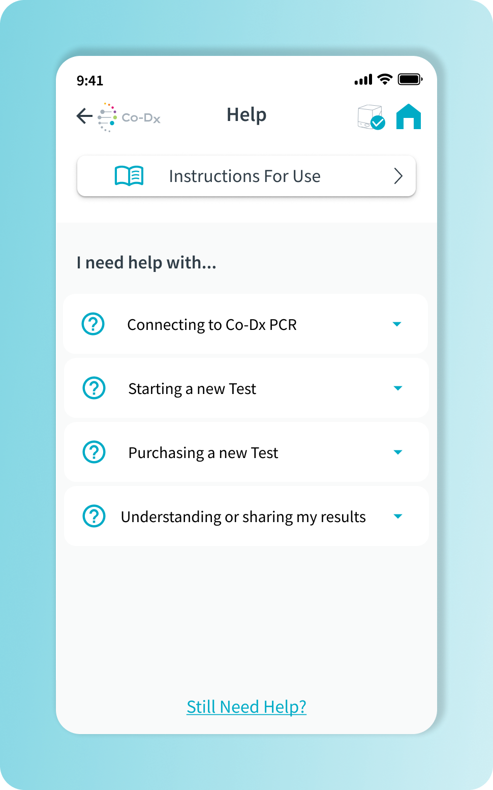
A streamlined interface for improved user flow.
![[interface] screenshot of collaboration interface (for a productivity tools business)](https://cdn.prod.website-files.com/694333edfae881550d65b3ae/69546039080093a377733f01_pcr-pro-header-image.png)
![[interface] close-up of the ai legal tech company's software interface](https://cdn.prod.website-files.com/694333edfae881550d65b3ae/69546300b62303bd206a982c_QRG%20Side%201%20(1).png)
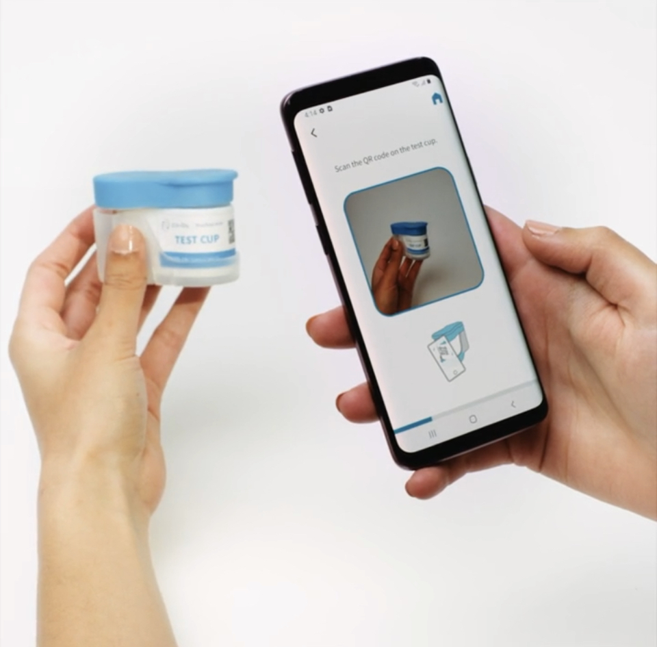
Documentation aligns physical and digital elements.

![[background image] image of fashion inspiration board (for a clothing boutique)](https://cdn.prod.website-files.com/694333edfae881550d65b3ae/695463e505ce517d28a6d30b_Workflow%20Running%2012.1%20(1).png)
Design and human factors work by grant adams
Co-DX PCR Pro™ | software team | 2022
Project supported in part by funding from the Gates Foundation
